
You are using an out of date browser. It may not display this or other websites correctly.
You should upgrade or use an alternative browser.
You should upgrade or use an alternative browser.
Love the "robot cheetah" on the home page, but...
- Thread starter podperson
- Start date
Why is the text in the red diagonal in a font that doesn't go with anything on the page?
I noticed that too but I was more distracted with the odd blurriness of the text then the font... :|
-- GS
Martin
0
Yeah it's blurry too -- perhaps it was rendered then rotated rather than the reverse. In any event, it's a bit of an eyesore.
I think in Pixelmator you don't have the choice to do it the other way.
What font would you propose?
Bye
Martin
novolume
0
Funny you should mention it Pod, when I saw it I downloaded the file and was having a play around at tidying it up but got sidetracked a little.
At the risk of facing a wave of criticism I'd probably go for something along these lines...
(There are probably a few things I'd change on the whole like including a try now button and price but here's a version with the same content as Martins)
At the risk of facing a wave of criticism I'd probably go for something along these lines...
(There are probably a few things I'd change on the whole like including a try now button and price but here's a version with the same content as Martins)
Attachments

Last edited:
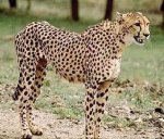
For what it's worth I think the head on the robot should be bigger.
Right now it seems correct for a cheetah's relative size... I don't know what you mean. Do you want a bobble-head? :tongue:
-- GS
I think you're right Terry
I've notice that too..
But only after I send the model to Martin :redface:
Sorry:frown:
Ps I've used that pic too for the BP:smile:
I've notice that too..
But only after I send the model to Martin :redface:
Sorry:frown:
Ps I've used that pic too for the BP:smile:
I think you're right Terry
I've notice that too..
But only after I send the model to Martin :redface:
Sorry:frown:
Ps I've used that pic too for the BP:smile:
Its still really cool, though! Besides, a small head makes you look strong.

-- GS
I'm happy with the cheetah itself (I cannot claim expertise on the size of the heads of robotic cheetahs), and I like the redesign novolume.
Martin -- I'd use the font "Helvetica" — probably bold — since that would match the page overall (and I'd change all the font specs on your page/site to be "Helvetica, Arial,..." instead of "Arial, Helvetica,..." since Arial is a poor man's copy of Helvetica. If you want to stick with Arial, then use Arial.
The general rule for typography is no more than three fonts in a design (where "font" equates to family + style + weight, so "Helvetica Bold" is one font).
I know it's nitpicky, but this is the home page for a product aimed at designers and artists.
since we're here, I'd add that this new header image kind of breaks the overall "soft" mood of the site imho. this has nothing to do with the great cheetah model, the nice render and the fact that is good to see new, fresh stuff in the homepage. I don't mean you have to change the header, just that if you wanna use this dark image you'd probably have to re-think the whole homepage... if you take a look at any other page you'll see what I mean.
of course this is just a personal opinion of an hobbist web designer... my 2c :smile:
BTW congrats on the main page header Weedo :icon_thumbup:
cheers,
Alessandro
EDIT: I know it's not an original idea but what about a slideshow-header btw?
of course this is just a personal opinion of an hobbist web designer... my 2c :smile:
BTW congrats on the main page header Weedo :icon_thumbup:
cheers,
Alessandro
EDIT: I know it's not an original idea but what about a slideshow-header btw?
Last edited:

EDIT: I know it's not an original idea but what about a slideshow-header btw?
I always love seeing those. What about some nice images from the forums, used with permission, or gallery work pointing right to the gallery, right there on the homepage in the slideshow?
I Martin and Everyone
What about something like this?
For me is a fitting tribute to Frank's work for the previous banner
I hope you like it
CHEETAH RULES
That looks cleaner and certainly more interesting then it was on black. The purple stands out more here, but that's a good thing.
Nice work Weedo!
-- GS
Martin
0
Funny you should mention it Pod, when I saw it I downloaded the file and was having a play around at tidying it up but got sidetracked a little.
At the risk of facing a wave of criticism I'd probably go for something along these lines...
(There are probably a few things I'd change on the whole like including a try now button and price but here's a version with the same content as Martins)
Hi,
and sorry for the late reply. I think that looks quite good. I just would propose centered dots and no normal dots between the "Model • Animate • Render". And maybe a little bit more cheetah tail.:wink:
Using the yellow for the small free update banner was a good idea.
Bye
Martin
Martin
0
The general rule for typography is no more than three fonts in a design (where "font" equates to family + style + weight, so "Helvetica Bold" is one font).
I will keep that rule in mind for future updates.:icon_thumbup:
Bye
Martin
Martin
0
since we're here, I'd add that this new header image kind of breaks the overall "soft" mood of the site imho. this has nothing to do with the great cheetah model, the nice render and the fact that is good to see new, fresh stuff in the homepage. I don't mean you have to change the header, just that if you wanna use this dark image you'd probably have to re-think the whole homepage... if you take a look at any other page you'll see what I mean.
EDIT: I know it's not an original idea but what about a slideshow-header btw?
You are right. The dark image indeed doesn't perfectly match to my light webpage. I actually plan a completely new webpage since quite some time but unluckily it is still just in the planing stage. The new webpage should become darker and a slide show header is also on my wish list.
Bye
Martin