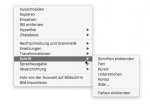
"deepened menu hierarchy with far more mouse clicks for often used functions": The main menu of v6 and v7 are pretty identical. Only the context menus of the 3D view have been redesigned to make them more uniform between the editing modes and therefore more predictable. This change is based on user requests and we once had quite lengthly discussion about the design of the old context menus here in the forum. They also contain way more tools now which required some sort of hierarchical organisation. I can't remember any complains about that feature so far.
Apple's user interface guidelines for contextual menus says:
Include only the most commonly used commands that are appropriate in the current context. For example, in the contextual menu for selected text, it makes sense to include editing commands but it doesn’t make sense to include a Save or Print command.
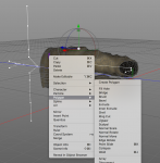
In the 6.x context menus the Polygon editing options would be at the top level when I select a model for editing readily available and applicable to the selection I made.
If you look at the 7.x menu there is a large number of items that are both completely irrelevant to my selection, in addition to these menu items being active although they have nothing to do with the current context.
What you essentially have done is duplicating a good section of the main menu in the context menu, thereby forcing the user to navigate one level deeper to get to the relevant menu item. The result is a lot more mouse movements to get to the same command + it makes you memorize you have to select Polygon to perform, say a Ring Cut, rather than it being readily available on the top level of the context menu.
This makes the application less fluid to use, and it force the user to memorize more of the menu structure making it harder to master for new users. This is also typically how we see menus constructed in Windows and Linux based applications. Copying that behavior is not a good idea on macOS.