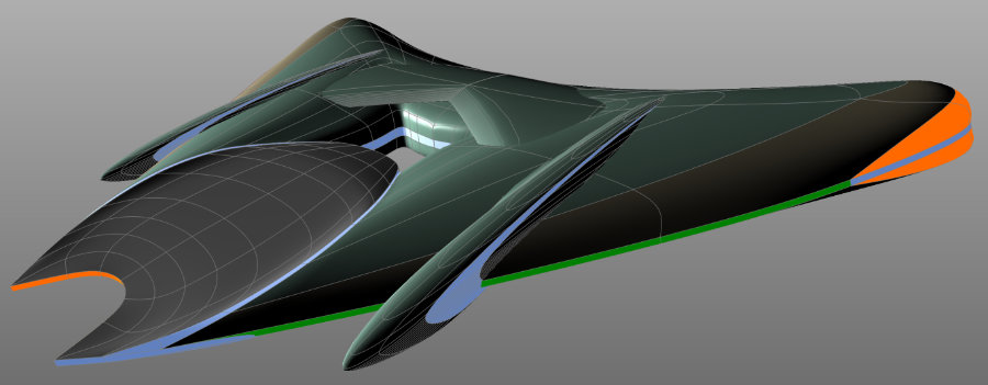
This project started out as a materials experiment, then, after a random image popped up on Pinterest, dove into a direct homage to illustrator Bradley Schenk and his die-hard 1950's retro-futurism (I've been a fan for years). After working on getting the shapes for
the old Chevy, I wanted to see if I could bend those skills into a cohesive original shape.
Building the wings was hard. I now have a much greater appreciation of what a design miracle the automobile tail fin is - there are organic shapes, there are geometric shapes, but it's damn hard to come up with something that bridges the two gracefully, especially if you're not beholden to practicality. Since my cycle body was straight 1950's, I wanted to see if I could blend it with something more modern. I started with modern machines, jets and such, mostly because I knew part of the body gadgetry was going to include those little exhaust ports on the side, stolen from the WWII military planes. But as long as I was thinking "in the real world", I couldn't come up with a shape that didn't scream "WRONG DECADE!" So I started fiddling around with shapes that were less real-world, less retro-futurism, and more organic. This organic form (made from severly mutilating a torus) produced a different kind of futurism feel - less Buck Rogers and more Popular Mechanics cover.

Alone, it's VERY different than the 1950's feel.
But the overall shape works with the body form the way the rear fenders of the old pickup worked: two distinct shapes pressed together rather than smooth blending, like the front fenders to the hood. At first it was still too different, but adding the bulge shapes the way jet engines mounted on the wings of early jets started to bring them together just enough that if I didn't call attention to the weirdness of the surfaces, the profile of the shape works well. So I used material changes to pull the eye away from the weird parts to the outer edges.
I always knew I wanted to use lighting to help push this away from the 50's, and once I saw that oval indention outside of the cabin area, I knew that would be my sideboard, so I changed the color there.
That's where the trim-lighting idea came in. Originally, I was using the gold trim to provide the splashy bits, but once the engine lights became important, the scene had to be darkened a little, and the gold stopped being shiny enough. The luminous materials helped call attention where I wanted it without having to go large with new shapes.
Through this process, I somehow started thinking of this thing less as a plane/motorcycle, and more as a boat. After all, it shouldn't have to land and take off on a runway like a plane, and without building elaborate landing gear, it would have to be flat on the bottom - which I definitely didn't want. If you put it in neutral, it should just float in the air, right? So, in my head, it became my Dad's ski boat.
The laws are such that the bow of the boat should have a light mounted on it - green on one side, red on the other. And the highest point near the center of the boat should have a white light, farther from the water than the bow lights. These are for night-time safety. They have to be in a position that they aren't obstructed from any direction so that, from the pattern of the lights, an observer could make a pretty good guess about how big the boat is, and which direction they're traveling. (I suspect that I still have the red and green lights reversed. I need to look that up). Now, my engines are giving off a lot of light, but I like the idea of the gadget lighting having some utility beyond the headlight itself. The wing shape just doesn't really lend itself to an old-style tail fin, so I started using the available polygon shapes on the wing to change materials so that I could add trim and navigation lighting. I approached it like the latest interior lighting on new cars. (OK, I approached it like the interior LEDs on cars from the 2000's, sort of "Look at me! I'm an LED accent light!" instead of today's more subdued, less distracting interior trim.)
Looking at it from your point of view, I get it. The wing's shape is working with the body, but lighting still screams "WRONG DECADE!" Mostly because it is. I used it the way we use LEDs now - sleek surfaces integrated into the shapes they're mounted into. I think that's what's bothersome, here. Instead of slapping a bulbous tail light on the top of the fender, 50's designers redesigned that corner of the car.
It's the smooth integration that's wrong. A 50's form would include some distinct shape change to say "There's something important here!" the way a good tail fin does. After all, a '57 Chevy didn't distract the viewer's eye with a color change that didn't include a piece of chrome trim. And since this is still happening on the outer edge, it still distracts from the weird surface changes. I'm going to keep the LED trim lights, but see if I can modify edge of the wing to make the lights more "physical".
I think it's worth a second look at the pod thingies, too. Maybe give them a stronger resemblance to the headlight's pod. Keep the wing's shape, but bring it's decor closer to the 1950's.
Thank you. Don't ever feel bad about making a suggestion. I love workshopping (it makes me feel like I'm back in my college ad art labs), and I don't have many opportunities to bounce around ideas this way. This is how a good idea gets pushed a little farther.


