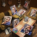
Usually I plain love your stuff. This time not so much, to be honest. The idea, as usual, is great, but there are some minor parts which take much from the picture.
The sore thumb of the ice was already mentionned, but the bottle is wrong, too. It doesn't look like glass at all, like the metal foil doesn't look convincing. The seams on the seats are to strong, the palette is a thad to big. The floor texture, in my opinion, is too small. You probably could do better with the texture on the staffage, too.
Sorry to be such a nibbler, but I really love the idea, and from the quality of your other great images I feel, that you could make a picture that's not just ok, but really great with this idea. As Shift Studio said, the idea and the composition are really great.


")